BBC – News Analytics Tool
As one of three UX Designers in a dedicated team working with 'Audience Engagement', 'Internal Tools' and 'GEL' to concept and produce designs for a News Analytics Tool to be used across a range of roles within the BBC.
UI, UX, Data visualisation. Designed on site at BBC

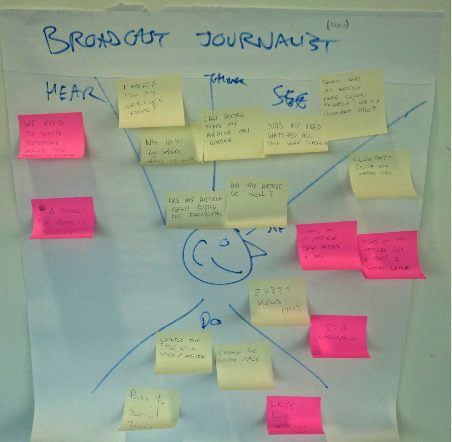
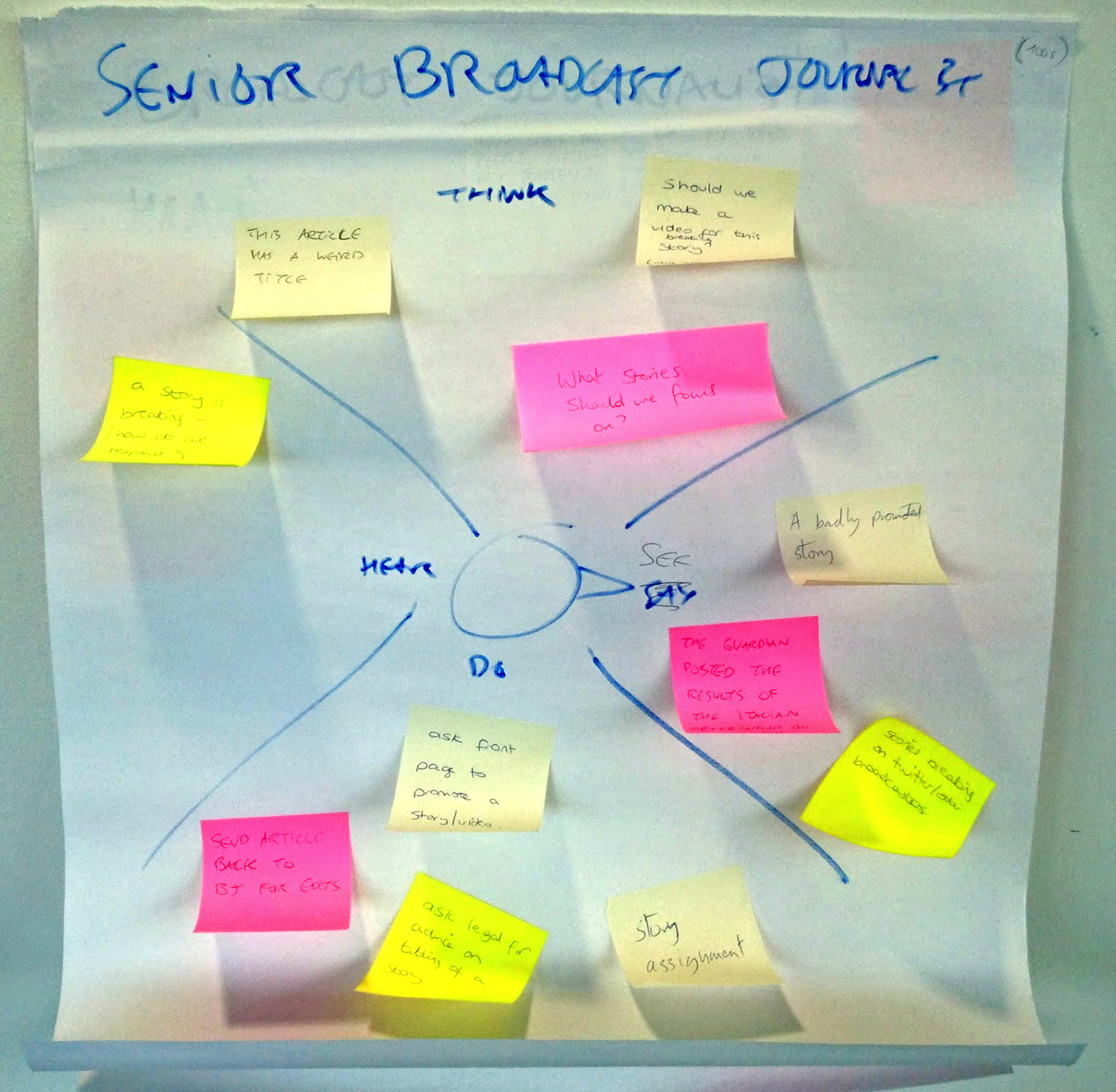
Personas
Personas were created by mapping the 'See, Think, Hear, Do's' of the various key roles. These were then applied to an article creation flow which provided a starting point for initial ideas.


Compiling feedback
Data from: previous user research sessions, team ideation sessions and stats available from the existing analytics tool were sorted and shared with users to help with prioritisation for card sorting.


Getting started
Senior Broadcast Journalists and Editors were identified as being 'super users' therefore the approach was taken to work closely with them to provide a comprehensive solution with all the relevant data. This could then be filtered and adapted for the remaining audiences.

Solutions
The designs were user tested across various roles on a weekly basis, the outcome of these would inform the following weeks iteration. There was also regular feasibility discussions with the development team and a prototype being created concurrently using live data — this was also used in user testing and provided a realtime view of how the actual data appeared in the designs.
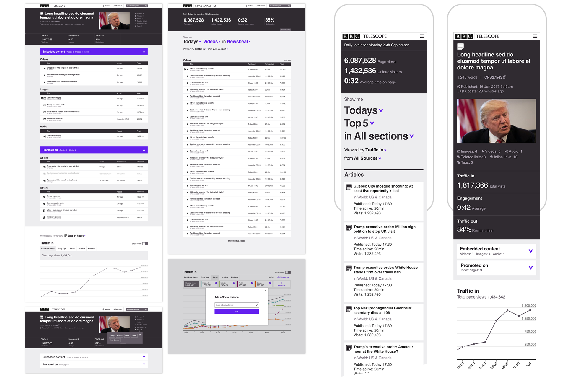
1. Homepage
Key performance statistics for the whole BBC website are shown at the top ('Show more' would be implemented at a later stage giving a more detailed breakdown of information). The page defaults to showing the top five 'Articles' and 'Videos' for the day. Each list item provides a snapshot view of the performance of the content and enables a link through to the detail page.

2. Filters
Content can be filtered from very broad to very specific using the in page navigation (as part of next development phases personalisation would be introduced, this would allow preferences to be saved for default states).

3. Detail View Page
The detail view is built around three key stages in a content's lifecycle: Traffic in, Engagement and Traffic Out – these were identified in the research phase. The masthead gives a concise view of the content's status with links to internal systems. Below the masthead are collapsed expansion panels which give a breakdown of elements used in the creation of the article and links out to where they are being used. The line charts plot Traffic in, Engagement and Traffic Out with the ability to filter into the various streams and to customise which data streams are viewable.
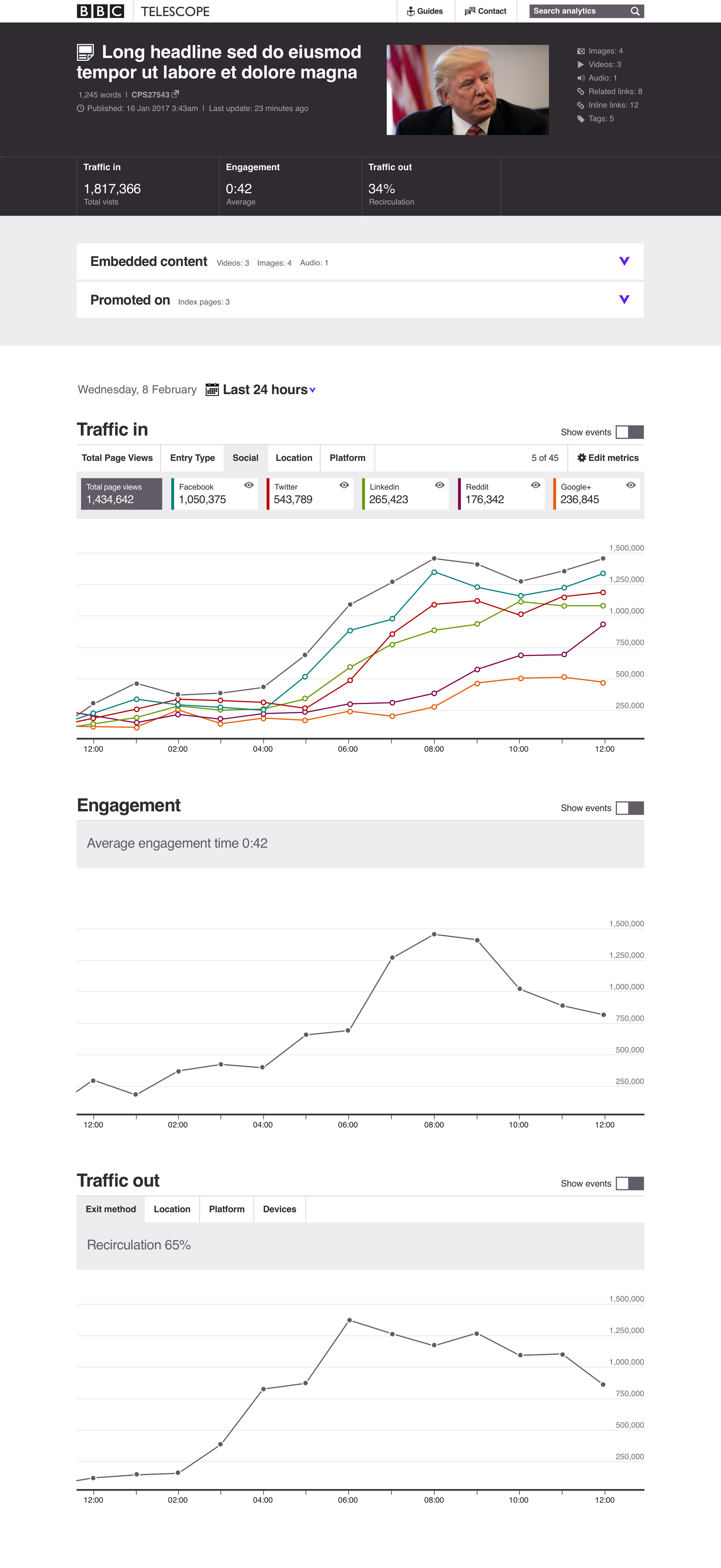
4. Line Charts
The design of the charts enabled customisable views from very broad to very specific. Each of the five tabs can display up to five configurable streams, each stream can be isolated and with the 'show events' toggle activated reveal the actions taken to within the nearest fifteen minutes. The Visual Journalism data visualisation guidelines were taken as a starting point — these designs were intended to eventually become GEL components.